Website Development
Developing Websites With ‘Bells n Whistles’
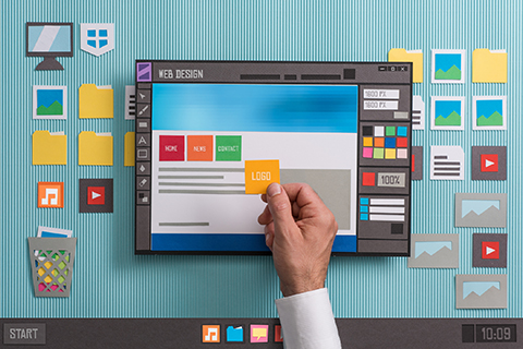
Website Design: Things You've Been Doing Wrong All These Years
BY Admin November 6, 2019
Website that brings revenue and boosts conversions is a dream filled with struggles. An appealing site is necessary but making money can’t be overlooked. Businesses focus on design but what they neglect is the fact that boosting conversion rates is also something their website has responsibility for. Ignoring this fact pushes potential customers away.
Thankfully, avoiding mistakes that hamper a website’s growth is possible by identifying and correcting them. As a result, leads, traffic and sales can be increased significantly. Let us now discover some of the mistakes...
Design Mistakes
-
1. Missing Responsive Design Responsive design allows everyone to access the website no matter what device they use. From desktops to smartphones, tablets and iPads, such sites are accessible everywhere. Guess what? Google recommends this too.
-
2. Missing Favicon Certain visitors are fond of using multiple tabs while browsing, which is why they leave tabs open to check them later. With favicons, visitors get the signs needed to orient themselves, are able to access everything they are interested in and visit the tab while browsing.
-
3. 404 Error Page As per an informal survey, most of the users are not interested in looking for a way to fix the 404 error. As soon as they see it, they jump back from the website and find comfort elsewhere.
-
4. Carousels on Home Page Carousels cause chaos when they scroll automatically. Appearing like ads, they cause a kind of banner blindness, thereby, affecting the visibility.
-
5. Slow Speed Web page that loads in more than 4 seconds is considered slow and a major turn-off. To keep visitors happy, Google recommends loading time of 3 seconds. Also, the popular search engine assesses a site’s speed via its own set of metrics, which include:
-
Time to first byte: When a URL is entered in a web browser, server is asked for that URL’s HTML document. Quick response time indicates fast loading of the page.
-
Start to render: Computer code makes as well as shows visual display. It makes visitors know that something is happening and page is loading.
-
Loading Accomplishing: Web page loading finishes and the page can be seen.
-
Document Completion: Even after the page is visible, a number of details continue loading in the background. While loading, this aspect determine completeness better.
-
Loading Accomplished: Once the site is loaded, asynchronous code starts. Because the code isn’t related to restricting users from using the website, it is in no way considered a part of website’s loading time.
-
File requests: When a page loads, CSS, Javascript and image files are loaded by the browser. As obvious, when a number of files load, loading time of the site decreases.
-
-
6. Slow Server Response No matter the web pages are optimized for good speed, the website will remain slow if serve response time is slow. It’s useful to know that slow server means performance problem. As per suggestion of Google, server response time should be 200 ms or less.
-
7. Design Norms Rejection Following design conventions matters for users. There is flexibility but caution is important. Inability to find search function or navigation bar doesn’t go well with visitors. Thus, the more the design norms the better.
Typography Mistakes
-
1. Unclear Font Hand-drawn scripts, cursive fonts and symbols are hard to read. Easy to read and think content is adored by the audience. When the font is unclear, cognitive burden increases and level of understanding decreases.
-
2. Inappropriate Tracking, Kerning & Leading Tracking means spacing that’s between words & phrases; kerning means spacing that’s between two characters and leading means space that’s between lines of words. If they are close to each other, reading and understanding purpose of website gets complicated. Overall, all of these hamper clarity.
-
3. Excessive Fonts Both font styles and font types lead to confusion when used a lot. They stop visitors from focusing on the needed thing. Also, changing fonts frequently affects cognitive fluency. To avoid such issues, only 2-3 fonts should be used.
-
4. Contradictory Fonts If the fonts chosen are conflicting in nature, using even 2-3 fonts is a bad idea. Reason being, they divide attention of visitors by diverting their focus from vital elements.
Content Mistakes
-
1. Content Not Focused on Visitors Creating content that’s all about a business but not how it can make a difference to customers and solve their troubles is useless. Such content stops visitors from turning into visitors.
-
2. Content Not Scannable While visiting a site, visitors have time to go through 28% text only. Well, it doesn’t mean limiting the content but yes, it means creating content that can be scanned easily. For example, a good content is the sum of:
-
Sub-headings
-
Italicized, bold and highlighted formatting
-
Short paragraphs
-
Numbered lists and bullet points
-
-
3. Ugly Usage of Whitespace It adds more to easy readability, clarity, attention and understanding. Lack of whitsepace makes the page messy and shabby. However, too much whitespace isn’t a good thing too because it means:
-
There’s no purpose for it
-
Even if there’s a purpose, it doesn’t fit with goals of the visitors
All in all, too much or too less whitespace reflects hindered focus and clarity.
-
-
4. Poor Grammar Bad grammar takes a toll on everything. No matter visitors don’t mind it always, if this turns into habit, they don’t like it either. Apart from affecting credibility of the site, it spoils the impression and costs high in terms of money.
Usability Mistakes
-
1. Not Responding to Visitors Questions Visitors have certain questions and they expect timely answers. If they feel ignored or unattended, they leave without waiting for any extra minute. Every website has its own type of questions depending on its type.
-
2. Poor Search Visitors find their interests through search. This is how they use small, large, easy as well as difficult websites. A search engine is considered exceptional if it handles:
-
Plurals
-
Keyword variations
-
Typos
-
Hyphens
-
Mavigation Mistakes
-
1. Same Color of Visited Links Links help the visitors to find where they are at the moment and where they were. Color of visited links help them to skip pages they got nothing useful from. Also, it saves their time by keeping them away from the wrong pages.
-
2. Centering Logos Now this is something important to know. A website with centered logo makes it 6 times more difficult for viewers to spot the home page easily.
-
3. Invisible Navigation Menus These menus make it hard for visitors to identify the menu items on the page, where will they redirect and whether or not they will solve the expected purpose.
-
4. Difficult Navigation Anything that bounces, rolls, looks flashy or moving annoy visitors when they are looking forward for answers to their questions. Despite finding answers of their queries, they waste time in identifying how to use the navigation, which makes them close the website and leave.
Graphics Mistakes
-
1. Generic Images Generic photos disturb the essence of a website and complicate its clarity. Users are unable to extract the message conveyed and lose interest since they conclude nothing from the content or message.
-
2. Inappropriate Size & Scale There’s no doubt that images that are either stretched or lack a standard size reflect non-professionalism. On the other hand are horizontal and vertical images that add professionalism. Moving on to large images, they reduce the loading time, thus, increase the bounce rate. When working with images, file formats like JPEG, PNG and GIF are considered best.
-
3. Unresponsive Image Size For responsive images, graphics and media, CSS media queries need to be used. CSS must be adjust changes in shape, size and resize media and images as per the screen dimensions.
-
4. No Metadata A lot of useless metadata is saved in digital cameras, thereby, making the images unhelpful for both search engines and users, thanks to irrelevant image name. Metadata should be stripped out and swapped with detailed data, something purposeful for search engines as well as users.
-
5. Not Supporting Browsers Website that doesn’t work in all browsers suffer major hardships. On that note, it must effectively operate on all the browsers and perform smoothly.
-
6. Dependency on JavaScript Be it the design or functionality of the web pages or whole site, it should break if JavaScript is turned off by the users.
-
7. No Image/File Compression There is a lot of information on the image files. These excess details are removed through image compression, which gives good quality but small file size.
-
8. No Browser Caching Enabling browser caching means fast loading time, it downloads the files at first but then saves data on the hard drive. It’s quite understood that it’s way faster to retrieve files from hard drive than from a web server.
-
9. HTML, CSS & JavaScript Not Minified Without causing any change to the code functionality, minifying code takes away the unwanted characters. When code is compacted, it not just enhance page speed but also improves performance of the site.
Legal Mistakes
-
1. No Privacy Policy Even though understanding privacy policy isn’t easy, 20% users read it. Having a privacy policy makes the website look ethical and standard. It makes the visitors believe that they are protected and valued.
-
2. No Return Policy or Warranty Information Return policy matters a lot to the visitors and gives them a feeling of security. Both return policy and warranty information are meant to boost the sales. When customers are comfortable in taking risk with a business, they in every way turn into loyal & permanent customers.
Conclusion
There’s a lot more to a website than just creating it because unless it attracts visitors and conveys the message to them, sales and profits are next to impossible. Keep these essential points in mind and you will surely see your business blooming beautifully.